Saturday, October 31, 2009

Thought this was pretty cool

518171192004978.jpg

518171192004757.jpg

518171192004728.jpg

518171192004702.jpg

518171192004678.jpg

518171192004574.jpg

518171192004555.jpg

518171192004538.jpg

518171192004481.jpg

518171192004461.jpg

518171192004437.jpg

518171192004409.jpg

518171192004385.jpg

Star Wars VS Star Trek

Statistics
Created: 10/10/07
Last Edited: 10/20/07
Views: 86386
Appreciations: 887
Comments: 72
Project featured on 10/19/07

Thursday, October 29, 2009

I found this blog and thought it was pretty funny. Here is the link: http://photoshopdisasters.blogspot.com/
It just shows how much you have to pay attention to what you are doing on photoshop.

Tuesday, October 27, 2009

Funny Invitation


I was looking up formal invitations. When I saw the script on this one, I clicked to enlarge it and it made me laugh so I had to post it.

Monday, October 26, 2009

Stritch Olympics

I created this logo for the Stritch Olympics this year. We also had it printed on t-shirts and posters.

Wing Event poster

This is poster I made for a wing event.

Sunday, October 25, 2009

Dinner Party Project

For my Dinner Party, my idea was kind of a star wars meets star trek. It would be a universe wide peace conference and the characters from the two shows would be invited. There are many different routes that I could take design wise. Some of my ideas were to use that perspective star trek style text. I could also make it very official looking. I looked at the United Nations design and logo, thinking that I could maybe go with a "united universe" idea. Another way I could design this would be with a futuristic, spaceship look. I could take ideas from the enterprise, the spaceship in star trek. I will do variations of these as my twelve concepts, but which ever way I decide, I am excited about this project.

Tuesday, October 20, 2009

Font Jokes

List of design and font jokes
Here's a collection of fonts about jokes and graphic design found around the internet. (thanks to Tom Saaristo for emailing me this first joke)
-----Four fonts walk into a bar.The barman says, "Get out! We don't want your type in here."
-----How many designers does it take to change a light bulb?Couldn't say--ask an account executive.
-----How many web designers does it take to change a lightbulb?Three. One to change the structure, one to update the style, and one to blog about the inadequate bulb support offered by today’s socket manufacturers.
-----What font did the astrologist use to write the daily horoscopes?Futura
-----1st Designer: “Wow, you always have so many fonts, where do you get them from?”2nd Designer: “Oh they come from Monaco, Geneva, Chicago, New York… I get them delivered at various Times throughout the day…”1st Designer: “By who?”2nd Designer: “A Courier!”
-----What did Helvetica say to Arial?You're such a copy cat.
-----What did the horse say to Bordeaux?Why the long type face?
-----One font meets the other in Rome. He asks: "Hey, are you a roman too?" "No," says the other, "but i'm an Italic!"
-----A font walks up to Gill Sans and asks: "do you want to go out with me?". But Gill Sans says "no". "Why don't you want to go out with me?" the other font asks. Gill Sans: "Because you're Grotesque!"-----

http://www.spudart.org/blogs/randomthoughts_comments/P3862_0_3_0/

Monday, October 19, 2009

One more

Here is another Rotaract Milwaukee design that I did.

Another One

This is one of the designs that I did for the Rotaract Milwaukee club. This will be engraved on a 5 x 8 in piece of wood and then sold as a fundraiser.

Random Design Jobs


This is a quick poster that I made for residence life for the Haunted Trail. I wanted that creepy kind of blurry look to it.

Wednesday, October 14, 2009

Typography

So, I thought it would be kind of funny to find some pretty ridiculous fonts and suggest them as an example of what not to use on the next project. I found this while just google searching and it just made me laugh so I had to post it. I wouldn't recommend using it on our next project though.

beard-font.jpg

Correction

I incorrectly attributed the "I'd live there" blog to Angie. Actually, that was Jessica's post. I am sorry.

Fallingwater

Frank Lloyd Wright designed this house, Falling Water. Angie's post "I'd Live There" made me think of it. The architecture of the house is really cool. It is actually built right on the rock.
Ever since we studied Wright last semester in Art History, I have really like this house. I'd live here.

fallingwater-2.jpg

fallingwater.jpg

fallingwater-1.jpg

Monday, October 12, 2009

Advanced Photoshop Magazine - Editor's Blog

http://blog.advancedphotoshop.co.uk/ - This is the web address of the editors blog for advanced photoshop.

Advanced Photoshop Magazine - Photo Face off

I was clicking through the website and I liked that they have these photo face offs.

It's easy! Click on your favourite photo from the two shown below to decide which one wins the face-off
If you can't decide just click here
Photo 1: green capturePhoto 2: get the girl...

Advanced Photoshop Magazine

Advanced Photoshop is a magazine that I have a couple of that I got off ebay a while ago. There are some really cool design things and good tutorials. Here is their website address: http://www.advancedphotoshop.co.uk/

Wednesday, October 7, 2009

Sushi Gas Station

uI went looking for weird food place combinations because of our discussion during the critique today and I found another gas station sushi place. It made me laugh.

Wednesday, 19 May 2009

  • Walking In Memphis - Gas Station Sushi

    Gas Station Sushi ~aka~ The Poplar Avenue BP station

    This is for real. It is not photoshopped and the sushi apparently sells well because it has been in business for a long time.

    I also don't recall hearing anything in the news about people dying from it..... Still for me the combination of gasoline and sushi is simply not something I am willing to do.

    Would you buy sushi while stopping for gasoline?
Tuesday, October 6, 2009

Funny Icons

I was just browsing google images looking at pictures of icons. Then I clicked on the search link funny icons. I ran across this set of smileys and thought they were pretty entertaining so enjoy.

Monday, October 5, 2009

"Scratched, bent, bruised and polluted"

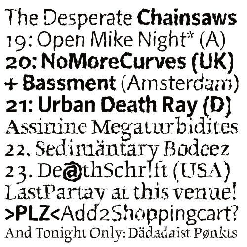
Reading through the first chapter in our Thinking with Type book, I really liked the page on type faces from the 1990s. It talked about how typography designers began to shy away from the clean, perfect letter forms and instead began creating typefaces that were more random. I really like the qoute on the bottom of the page, "The industrial methods of producing typography ment that all letters had to be identical . . . Typography is now produced with sophisticated equipment that doesn't impose such rules. The only limitations are in our expectations." - Erik Von Blokland and Jan van Rossum. These two designers created my favorite typeface used as an example on that page, Beowolf. This font introduced randomness the outlines of the letters and the position of individual words.

Double eye


I was searching for eye pictures for the icon project on google and this picture popped up. I thought it was really clever. It was created by Berlin artist
Olafur Eliasson. It is just a good example of the things you can do with photoshop.

Sunday, October 4, 2009

Badges


I fixed the colors. I went with a blue and yellow because the three lines kind of reminded me of rays of light. I also added a curved line element to contrast those three straight ones.