I put my periodic table, Woodstock poster and teapot in CMYK's first Open Gallery Night. CMYK is Stritch's new graphic design (aiga) student group, in case I haven't mentioned that before. This event was really fun and I was impressed with the turn out. It will be continued in the future.
Overall, about Woodstock, it was nice to present what I considered to be a very fun project and show how much work I put in. I got a lot of good reviews and am definitely keeping this peice in my portfolio.
Thursday, December 9, 2010
Final Periodic Table
This is the finished design for the periodic table. I chose a dark background because all the color just popped better. I am happy with the way it turned out and even had some requests to make t-shirts out of it.
Civil Rights Pilgrimage T-shirts
As a final job for my Civil Rights Pilgrimage experience I got to create t-shirts. I used the application advertisements as a base and created a stamped look. I also had the idea of printing on the full front of the shirt. Here is the concept I presented to our group.
This is the final design that will be printed.
This is the final design that will be printed.
Flyer Designs For Kaleb Reetz
This is a flyer that I helped a friend create, along with a corresponding tri-fold registration form. I was able to find the same font used in the logo so I think it works well.
Logo Design for Melissa Webb
Here is one of the logo designs that I created for Melissa Webb's photography. I like the lens that I drew in Illustrator. We decided to work with a different design because this one would be harder to put on photos.
Visual Studies Final Designs
Wednesday, November 17, 2010
More Cup Cake Tin Design
Original Design
This is my other set of designs with the cup cake tins. I don't think it as strong at the other one though. I do like the monochromatic one wit the green being bright in the center and then fading out.
Cup Cake Tin Designs
Warm Colors
Monochromatic Color
Monochromatic Color
Complementary Colors
Original Design
This is one of the designs that I created with my cup cake tin scans. I like this, especially the warm color design because it feels very organic which contradicts itself because it is my mechanical, man made item.
Tuesday, November 16, 2010
Wednesday, November 3, 2010
Edible Scanned Item
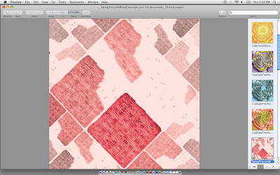
I scanned Triscuits for my edible item. I ate most of them first but the few I scanned looked really cool. I like the texture. Here are the scans.
Cattail Scans
My organic object for the project are cattails. I thought they were interesting because they have a lot of texture and then some of them have seeds that were poofing off. Here are the original scans.
Subscribe to:
Posts (Atom)


