

Sunday, October 24, 2010
Shot Cards
One of the goals of Open Bar Night - Ladies Night is to raise awareness about the Gardasil Vaccine. I am collaborating with the Student Health Center and will hand out cards that allow student just to walk in and receive the vaccine with no appointment. These are the designs that I did for the cards.

Open Bar Night Poster
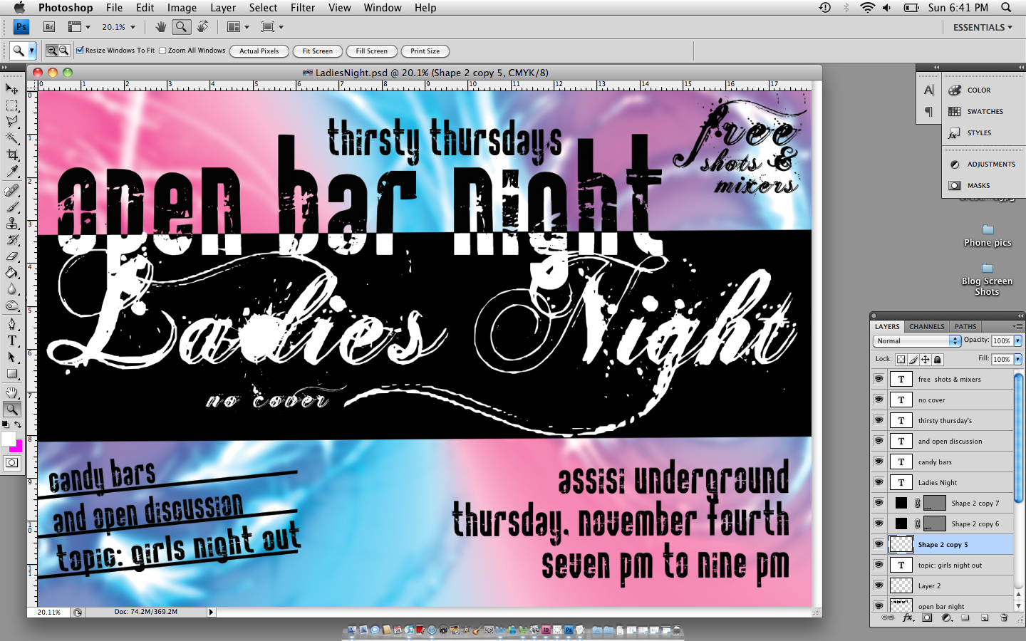
Here is the latest design for the poster publicity series for my open bar night program. It is going to be Ladies Night. I liked the background of more girly colors and light swirls. I am also a fan of the font I used for Ladies Night. It is called Ginga. I stuck with the Rock it typeface so this poster is consistent with my other Open Bar Night Designs.

Wednesday, October 20, 2010
Another CRP Poster
So for the Civil Rights Pilgrimage we are trying to collect last minute applications. In order to do this we are going to have a "Last Chance to ride the Bus" night. Here is the poster I designed for the event. I tried to keep with the over all scheme of all my crp designs. Used the bus as a background and grid to break up the information and used a bold form of my typeface. For a fifteen minute poster, I am happy with how it turned out. You will see them around Stritch soon.


Thursday, October 14, 2010


This is Awesome
Please Don't Ever Photograph These Seven Things Again
 Most of us post stupid pictures of ourselves on the Internet constantly, but it's time to stop being annoying attention whores. The first step? Never photographing these seven things again.


Republished with permission from Matthew Inman aka "The Oatmeal," a former web designer turned comic artist. You can see more of his work on The Oatmeal. Matthew is a one man operation, so be sure to check out posters and prints from his shop.
The author of this post can be contacted at tips@gizmodo.com
Friends Tattoo
Designed this for a friend. He already has the turtle on his shoulder and wanted some tribal design around the out. We looked at a lot of tribal designs and he picked out a circle on to start with. I then created a vector design similar in Illustrator. Tattoo design is fun and I like the swirl effect of this design. He said the meaning behind his turtle is that turtle are slow and steady and just continue forward. The tattoo reminds him to do that when he is stressed. So I added that the outside circle was like the whirlpool that is life. It is all the spinning and craziness the turtle swims through.


Thursday, October 7, 2010
Growing Circle
These are the logos and the mastheads that I designed for Growing Circle.


For the color and the black and white logos, I darkened all the grays so you can actually see it. The only thing I think I need to work on yet is from far away the stroke around the small logo standing as the "o" worries me. Otherwise, I really like the logo and the background works well to give it shape.


On the mastheads, I added the logo background in the lower right corner and the water color border. I tried adding a color background but didn't think it worked. I like that on the color one, the only color is the logo like the center of a queen anne's lace flower. The background colors were either to dark and then when I tried changing the value, it either looked orange or pink. I think the border works because of the the outline text: Gr wing. Another change I might make is flipping the logo so the swirls direct the viewers eye back on to the masthead. The stroke also worries me on this design.
The reason I wanted to have the black stroke around the small logo is because it matched the outline text and made it stand out just a little bit more than the letters. I think it could be successful it i got the size right. Other things I tried were a drop shadow and duplicating the logo a little larger in black behind it but it just didn't look as nice.
Monday, October 4, 2010
Green Tree Documents
These are the Green Tree Document comps that Rachel Winter and I presented last thursday. Our next step is to refine the blueprint sketch so your eye has a intentional direction to follow around the page. Overall I really like our design. I think the typeface relates really well with the blueprint sketch and it also fits the project because it is an exact sketch of living green, enviormentally friendly architecture.

The Cover of the Program includes the garden section of the blueprint sketch and the text is placed in a box formed by a room of the building. I think the spacing around the text is nice and like that there is not a whole lot of text on the page. One thing to work on, on this page is make the drawing a little less busy.

This is the agenda and an awards page in the awards dinner program. I think the text is laid out well the heading in the novelty font. The sketches on the side may change a little bit but overall I think the spacing around them is pretty nice.

Here is the dinner menu and another awards page. I think the text on the left page is pretty heavy, especially compared to the menu, which is very spacious. I really like the designs on the menu. I am not sure how to fix the other awards page.

This is the back page of the program. We had the idea to do a re-statement of all the information on the back as kind of a summary instead of putting it on the cover. When we met with The Garden Club rep on Thursday she really liked this idea. I also really like the little design on the bottom of the page. I think it is a good ending point.


This is the front and back of the invitation. The concept is that the section with the G will fold over and cover the G on the other side. This way when they open the invitation it will be revealing the back yard with the green part of the design. The entire blueprint is shown on the invitation when it is fully open. We are working on it to make it a little less busy. I like the back page because the line design from the garden clearly points from the text. We will edit this design a little bit to use the space a little better but still keep that idea of the lines directing your eye.


This is the front and back of the back. I am really happy with how they turned out. The front will change a little just to make it less busy. I like the back because each day on the agenda flips but the information is still really clear. I also like how the drawing divides the space.
I think this design is successful and Rachel and I are meeting today to put in the final drawings and fix some of the things that I talked about.
Cutting Board with all the information
I am really happy with the cutting board idea for my periodic table of salsa design. I have all the information laid out on the the table. Probably still going to add a bowl of salsa in the bottom left. Some strong points of this design are the seasoning shakers. I really like them. I also like all the colors on the chopped up vegetables. I still need to tweak the text color and the typeface. I am excited to keep working on this design.


Subscribe to:
Posts (Atom)