
Monday, October 5, 2009
"Scratched, bent, bruised and polluted"
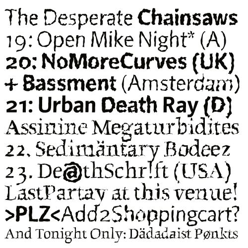
Reading through the first chapter in our Thinking with Type book, I really liked the page on type faces from the 1990s. It talked about how typography designers began to shy away from the clean, perfect letter forms and instead began creating typefaces that were more random. I really like the qoute on the bottom of the page, "The industrial methods of producing typography ment that all letters had to be identical . . . Typography is now produced with sophisticated equipment that doesn't impose such rules. The only limitations are in our expectations." - Erik Von Blokland and Jan van Rossum. These two designers created my favorite typeface used as an example on that page, Beowolf. This font introduced randomness the outlines of the letters and the position of individual words.
Subscribe to:
Post Comments (Atom)
No comments:
Post a Comment